Module Navigation

Games Production: Professional Practice (Captain's Table reflection)

This post if about the reflection of my Captain's table project.

Overall, I enjoyed this project more than the light rig, as I feel like I had a lot more creative freedom undertaking this project, furthermore, I could push the narrative a lot more with this project.

Here are some positive takeaways from this project:

  • The cohesion and research moulds in nicely, everything looks like it belongs to the project, there aren't any intense outliers in terms of props
  • The texturing for the assets look believable and meet the realism standard I was hoping for, they are by no means photorealistic, but enough detail is on the assets to make them readable and believable.
  • Geometry was utilised well, especially on the desk. There have been some instances where I was unable to optimise certain assets, such as ones with cylindrical objects, but for the most part, optimisation has been undertaken efficiently.
And here are some things to reflect on:
  • I got quite close to the tri count, so I was unable to undertake a lot of the things I wanted to do. For example, I wanted to make the entire room for a nice flythrough, but unfortunately, I was unable to do so. I could have potentially circumvented this by meticulously thinking about what props I could have changed, however, the props I did select did look nice inside the scene.

Games production: Professional Practice (Captains Table finalisation - week 10)

To finalise my captains table, I wanted to make sure I checked off things from the brief.
For example, I made a flythrough for the level, which was a way for me to not only demonstrate the layout of the assets on the desk, but also to get some clever shots in to the level.
Within the flythrough, I have added some deeper context, for example I did a match cut between the jade doll and the compass (in film a match cut is where you cut between 2 scenes with an object of similar sizes and positions.)
Here is an example of a match cut from 2001: A Space Odyssey, where the bone is thrown in the air and then contrasts with the ship in space - https://www.youtube.com/watch?v=W2hjlA1rEfM


Match cut example from flythrough

My next example is the Jade head, when it turns it ends on a Dutch Angle (In film a Dutch Angle is used in contrast to a straight shot, this angle is skewed to give a sense of danger, unease, etc.) But in combination with this angle, the head has an orange halo around the edge, as if it is facing towards the sun. Which in a deeper sub context relates to civilisation in Central American cultures like the Maya, Aztecs and in addition to the Incas (Southern America) where gods of the sun are prevalent. So the head looks like its facing upward toward the sun and this shot emphasises it by being skewed in an upward direction.

According to Britannica: 'In the pre-Columbian civilizations of Mexico and Peru, sun worship was a prominent feature. In Aztec religion extensive human sacrifice was demanded by the sun gods Huitzilopochtli and Tezcatlipoca. In both Mexican and Peruvian ancient religion, the Sun occupied an important place in myth and ritual.' - https://www.britannica.com/topic/sun-worship

Jade head from flythrough

As stated in previous weeks, this head is relevant to the Maya due to their language and script, so making jade carvings related to their culture, in the example of this head wouldn't have been uncommon.

Creating heads isn't new for Mesoamerica the Olmecs (A previous inhabitant of Central America) created head carvings/statues a full 800-1000 years before the Maya, knowing this, it is engrained into Mesoamerican culture, such as the Toltecs, Olmecs, Maya, Aztec, Inca etc.

Explorer with Olmec head statue


Timeline of Mesoamerica, denoting the Olmec and Mayan Time frame, roughly 800-1000 years apart.

Another cool feature I implemented into the scene to help, was parameter controls. I added sections such as Fresnel refraction to get subsurface controls, as well as clamping the darkness and highlights, among other things.

Changing the various settings attached to parameters


Master Material for above instance

I also wanted to fulfil the brief with some wireframes, here are some wireframe examples rendered out from Marmoset Toolbag.

The topology of the desk is connected at points, this was for optimisation purposes, for example, on the sides of the desk where the mesh is triangulated to the corner, I could have easily just looped this around the desk, but instead decided to weld the verts to the corner, which cut the tri count by ~1000 tris when applying this principle around the mesh.


It is always more difficult to optimise cylinders, especially when you were told to not make objects look faceted. In this case, I could have easily exceeded a necessary tri count for a prop of this scale, but I tried to texture it to the best of my ability, so it would help the object look more realised.


Here is an example of a Marmoset toolbag render of the lamp prop for my portfolio. Though it is in the scene, it is worth having the best prop renders as well, not only to pad out portfolio space, but to also give the viewer reassurance that the prop is believable, textured well and grounded in the project.


I thought as a method to get people to understand how the prop was constructed, I created a breakdown consisting of the different maps and UV unwrap, this way a potential employer, person viewing my portfolio or curious individual could see my methodology behind making an asset and how I like to go about sorting out textures, i.e.: how I pack my UVs and what order I channel pack my AO, Rough and Metal.


Another Marmoset render example.


Games production: Professional Practice (Week 9)

As it is coming to the final couple of weeks of the project, I thought it would be fitting to start finalising and polishing the level.
A nice ambient effect I added to the scene was some dust particles, I created this by making an emissive material with opacity which I would use as the base dust particle.
Combined with this, I added a material instance with many parameters which helped me control the particle when it was set in the Niagara system.

Dust sample from level


Dust sample from light


Dust material with parameters controlling certain aspects of the particle


Dust in Niagara system made with the Hanging Particulates setting


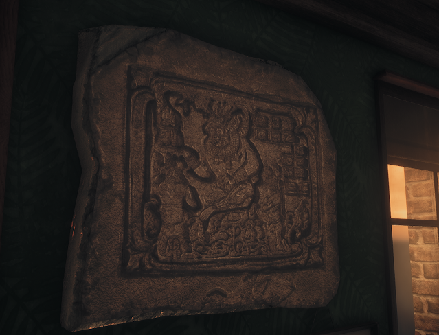
To add some additional interest, I created a Mayan stone slate which I added to the level, it adds some more narrative along with the jade artefacts to show that John is an avid collector of the Maya and intents to collect more, maybe on borderline obsession of becoming famous like what happened to the explorers of Tutankhamun in the 1920s. 


To help the authenticity of the slate, I sourced the texture from the following link - https://en.wikipedia.org/wiki/History_of_Mexico#/media/File:Cancuenpanel3.jpg
By user: Authenticmaya-commonswiki
I created an alpha from the sourced image and used it as a height stamp to texture my work.


Generated alpha which I could use for height and AO


Texturing slate inside substance painter where I hand painted edge cracks and wear to help this stone material be more believable.

Games production: Professional Practice (Week 8)

Here is an update post to my level, a lot of the texturing is finalised, but I want to add some extra settings to my scene to make it stand out

After colour grading


Before colour grading


A way to enhance my scene was to create a custom colour LUT for my post process volume. Many of the filter I used were to enhance certain colours like green and red as well as desaturating the harsh oranges, I did this to make it look slightly older and make it look more period.

Colour neutral LUT (Top) Custom LUT (Bottom)


When modelling my books, I thought about having the text baked on to the meshes, but realising I could use mesh decals for the book text, I could unwrap planes on the spine of the book over a mesh decal sheet, which would give me the opportunity to have different shaped books as well as change the colour of the book without changing the colour of the mesh decals, changing the colour of the books would be another way to add variety to the scene, additionally having the extra different sized books helped the believability and not look blatantly instanced.


Master material for book


Material instance controlling the parameter values of the book


As a result of the material colour, I was able to uniquely apply more material instances to other books in the scene as they were all unwrapped on one UV sheet, which gave me the opportunity to make them, Red, Brown and Green respectively.

Mesh decal unwrap 


Here is an example of the Mayan lettering system I used on the books, as well as the infamous Mayan calendar, which wasn't just a huge part of Mayan culture, but also part of ours, predicting the end of the world in 2012.


Book with separate ID for book, paper and mesh decals


By adding these callbacks on to the mesh decal texture, it made the books look authentic, not just because of the symbols, but also the author of the books.
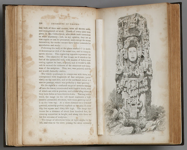
John Lloyd Stephens (or in this case, just Stephens) was an American explorer during the 1800s and discovered Mayan ruins in 1839, then published his books: Chiapas and Yucatan (1841) and Incidents of travel in Yucatan (1843)


A passage excerpt and drawing from Stephens book 'Incidents of travel in Yucatan'


Here is the textured map for the region, the left circle with a question mark denotes uncharted territory and predicting potential extent of Mayan Civilisation. The x spot is roughly the geographical location of Chichen itza, a preserved Mayan temple and the lines with a circle denotes the rough location of the border for Honduras and Nicaragua, which was the furthest extent south for the Mayan Civilisation.


After looking at my scene, I thought it would be a really cool idea to project the window shadows onto the desk.
I remember this because my Grandad had a window like this (Albeit much wider) and there was a shadow cast on the chairs beneath the window. A way I thought about doing this was to increase the intensity of the light, which did work, but of course, you couldn't see anything due to the sheer intensity of the light.

Front room of my grandads old house.

So what I did instead of increasing the light intensity was opt for the lighting card method. I stumbled across this randomly while looking in engine for solutions and from my understanding, light cards are essentially decals, but you can project them over emissive materials/make decals for emissive materials.


Here is an example of one of the two alphas I used for this effect. The other alpha is just the window, not with the machete silhouette inside it.
The way the lighting card works is the white bits project lighting, but the other bits are alphas, which retain the information from the underlying material/mesh (like how a normal decal with opacity functions.

With lighting card


Without lighting card

It is a subtle change and it does increase the shader complexity a bit, but the effect works for the scene, having a projection like this would really help for close ups and cinematics, adding to the overall ambience of the scene.


Assets on lighting channel 0 and 1, affected by the directional light and point light


Light on lighting channel 1

A way to highlight props was to give them lighting channels. I did this with various assets in the scene, it was a good way of giving props depth but without showing terrible lighting complexity within the scene. So I decided to put assets on lighting channels like the example above.

Example of the level lighting complexity


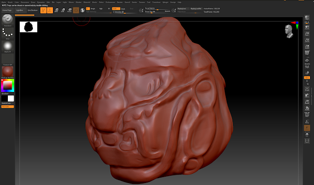
Mayan jade head sculpt using Zbrush

Jade head reference 

This is the Mayan head I sculpted inside of Zbrush, I used Zbrush as it has a more organic feel. Trying to capture the reference as much as possible. It isn't 100% accurate to the reference, however, not being 100% accurate to the reference is fine, because it isn't going to be animated and is going to be a static mesh, any person could have sculpted this in a number of different ways, making it more unique to the scene.
The texture also gave me a lot of options to add shaders, texture details, etc. Consisting of various features like subsurface, colour offset and noise filters. Overall there was room for experimentation, unlike other objects where it had to be objective, like wood, this asset could have a more subjective take, as long as the material was readable as jade, I could add my own details, like cracks or sculpt it how I wanted to as long as it was somewhat faithful to the reference.


Analysing surface properties inside Substance Painter

Here is an analysis breakdown of the head within substance painter, showing different elements of the texture that makes it readable as (Nephrite) jade/jadeite.
The texture is more consistent with Nephrite Jade as opposed to Jadeite Jade as both consist of different compounds - Nephrite jade is a more opaque and darker form of jade compared to Jadeite; Jadeite has more subsurface properties and is more luminous.


Nephrite Jade VS Jadiete Jade - Gem Shopping Network - https://www.youtube.com/watch?app=desktop&v=r0oPwFeHwJY


Self Directed - Photogrammetry Task

I wanted to enhance my skills by continuing learning new work flows.

I had previously attempted photogrammetry/photo scanning before, however, I wanted to refresh my knowledge on how the process works.


Here are some image examples from a data set of 215 total photographs.


This is the final high poly generated by substance sampler, along with its base colour data set that it automatically generated.

I didn't download the retopology tools for 3ds max on my home computer, so I was unable to access them.

So I took the mesh into Zbrush and painted in some Zremesh guides.

When I had generated a lower poly mesh without the bumpy inconsistency of the high poly, it was time to retopologise using step build.


After retopology was finished, it was now time to bake the high poly data set on to the low poly model.

I did this inside of substance designer, where I was able to 'transfer texture from mesh' - by using the substance sampler generated base colour.


And finally I finished off texturing inside Substance Painter - I believe the way substance sampler calculates roughness and metallic isn't particularly accurate, so I put the asset inside Substance Painter to texture manually.

Adding in additional AO, Height/Normal, Roughness and Metal information where I thought it would need it.


Here is a real world example of it being placed on a table with a table cloth texture I ran through substance sampler, all of the final renders were presented within Marmoset Toolbag.


Comparison of the Substance sampler default textures and the retopologised UV space from the substance designer bake.

Games production: Professional Practice (Week 7)

 This week I started to put my assets into Unreal engine.

Most assets remain untextured at this stage, so I was able to work on the composition of the desk and how I wanted objects to be arranged.
As mentioned in previous posts, I went with this desk as there is a lot more room to experiment with, compared to my second desk option which would have been a bit more confined.

Then referring back to my reference, I put in made a boolean mesh within 3ds max, which would act as the windows would help light come in to the room. The method of lighting I used here helps light up the assets but also gives me a lot more opportunity to experiment with other lights and lighting channels within engine so only certain objects get effected by the lights.
Furthermore, I used a mixture of Exponential Height Fog and the Directional Light to add some Lightshaft Occlusion to the scene, this made the scene look nice and gave a bit more attention to the assets and a feeling of leading lines, from the window to the desk.
Like the last brief, I went ahead and added the Screen Space ambient occlusion with the following commands.
r.Lumen.DiffuseIndirect.SSAO=1
r.Lumen.ScreenProbeGather.ShortRangeAO=0


Even though Unreal 5 has Lumen, which is really good at controlling Material AO, I wanted to find a way to add back SSAO for a bit more control, as I feel the light doesn't hit in certain places and can Lumen sometimes doesn't count AO under objects which should in theory be occluded, even slightly.

Additionally, the sun being part of central american culture is another narrative piece, especially the Inca civilisation, which I will go through in a future post.


Here are some examples of prop texturing, I grouped most assets in by relevancy, I called the texture consisting of the: Map, Telescope, metal compass and compass - 'Navigation props' to me it would make sense, I exported these assets at 2048, not only because it is a set of hero assets, but also the map is a similar size to the desk, which gave me a reason to export at a higher texture resolution.
I used a mixture of generators and hand painting to get the final outcome of these textures. For example on the machete, I used various offsets of scratch masks and to do some final enhancements, I hand painted some scratches. As for the colour, I added some fill layers and added random generators then blurred the final outcome, these colours were too harsh, but toning them down to look like it had been used, like a brushed green, as if it sliced through plants and gathered excess dirt worked well.


Annotation of my theory behind the texturing process.


Layer stack for the handle part of the machete


I also created some custom stamps/alphas for the texturing phase as it was sometimes too complex to draw the shapes or the symmetry did not faithfully stamp how I wanted it to.


Compass needle alpha


Measuring ruler for globe spine


Keyhole Alpha


I exported these directly out of Photoshop and into Substance painter and started applying these to the relevant channels like Height, AO and Base colour.

Machete and Magnifying glass unwrap


Navigation meshes unwrap


Here are some unwrap examples, like mentioned previously, due to the size of some assets, I believe it was justified to put these on a certain sized texture sheet.
To help the scene, I added a brick pillar outside, I did this to make the room seem like it was attached to a building, it worked with the wood pillar, however, just to ground it further I added the brick pillar.
Historically, I have struggled with brick texture making due to their organic nature. So I invested my time into looking up photoscanning and stumbled across Substance Sampler.
I took this picture of brick on the side of a friend's house, making it as square as possible as to make re-alignment easier.


When implementing the texture in to sampler I added a few filters, such as, 'equalize' which helped balance the tone of colours from the high, mid and low range. Furthermore, I added other tools like perspective transform and tiling to help align the texture in order to remove as much of the seam as possible. Content aware fill, just to remove some of the splotches created by the seam. Normal to Height, to change the intensity value (to control later with unreal) and Height to AO, in order to see the AO coming out of the side of the brick from the sampler tessellation.
After I finished with sampler, I took the project and put it inside Designer, this was only to add a 'make it tile' node, in order to shrink down the texture size, as it had grown during the perspective transforming process inside of sampler.

Games Production: Professional Practice (Captain's Table reflection)

This post if about the reflection of my Captain's table project. Overall, I enjoyed this project more than the light rig, as I feel like...